Despite office casual, strategic men still present themselves with purpose. How your dress shirts can influence perception through the psychology of color.
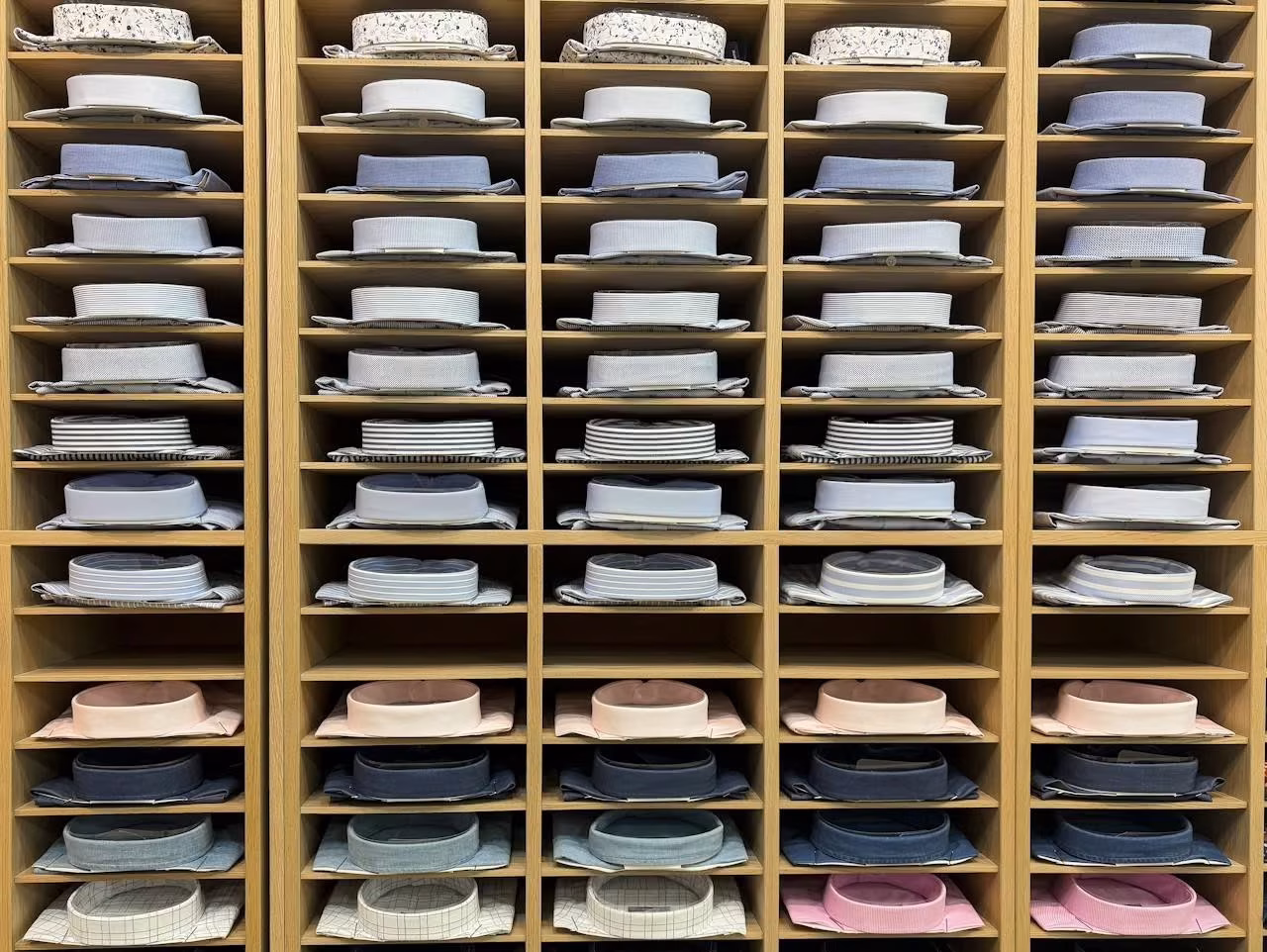
If you’ve read my posts How to Build a Capsule Wardrobe and How to Declutter Your Closet, you’ll already know that I have 20 dress shirts, which I wear mostly at the office and for worship.
These are of various hues, but there’s nothing random about them. They all have a purpose depending on the occasion and how I wish to be perceived.
Why Wear Dress Shirts?
My workplace adopted business casual several years ago. For some, this means beach-ready, even if the coast is many hundreds of miles away. And there’s the 55-year-old with his ripped jeans—the less said the better.
Apart from removing my tie, I changed nothing; nor did our senior executives. Clever people use clothes strategically.
Opting for dress shirts over T-shirts and tucking them into your trousers is about dressing deliberately. It influences posture and tone, conveying reliability and consistency.
And the colors you choose amplify this.
Colors Are Mood Calibrators
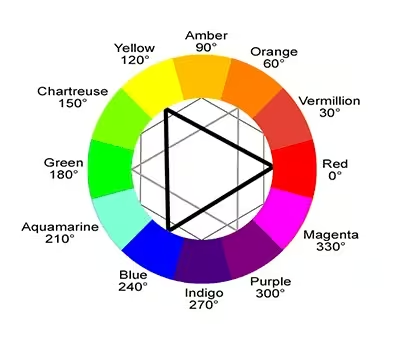
Let’s face it, if film directors use color to control perception on screen, why wouldn’t you use it in real life?
Think about how red signals danger or seduction, blue evokes melancholy or trust, and earth tones suggest grounded reality.
Costume designers don’t choose colors arbitrarily—they sculpt audience emotion; you can do the same with your dress shirts.
Don’t just wear clothes. Direct scenes.
Identifying Your Colors
But there’s no point in wearing colors strategically if they make you appear washed out. They should enhance your complexion.
Most men know instinctively what suits them best—either cool or warm shades. But in case of uncertainty, here are two quick tests.
The White Test: In a well-lit room, hold pure white fabric close to your face.
- If your skin reflects a pink or rosy glow, you’re likely cool-toned.
- If it picks up a yellow or peach cast, you’re likely warm-toned.
The Vein Test: Look at the veins on your wrist under natural light.
- If they appear blue or purple, you lean cool.
- If they’re greenish or olive, you lean warm.
Back in the 1980s, the trend was to group color types into seasons. To my confusion, I was both winter (cool) and spring (warm). I later learned that I’m neutral and can wear both palettes.
This is what I’d been doing, anyway. In other words, your own instincts may be more reliable than the results of a test.
And if somebody has complimented you on a particular color, it’s one you should wear more often.
Which Colors Do You Need?
To experiment with color psychology, start with only a couple of basic colors.
My dress shirts are mostly blue and dark red, with a few based on gray and white.
The secret to variety lies in pattern. Some are plain, but most feature fine stripes or checks, allowing me to ring the changes.

Dress Shirt Colors for Cool Types
Cool colors are the backbone of corporate and formal dressing. They signal clarity, control, and discretion—ideal for interviews, meetings, and worship.
These include:
- Pure white
- Grays like slate or charcoal
- Dark reds, including burgundy and aubergine
- Desaturated or gray-greens
- Pale blues like ice blue and steel blue
Such shades project professionalism. They anchor your presence in trusted visuals.
Dress Shirt Colors for Warm Types
This is where it gets tricky. Men with warmer undertones often try to signal professionalism with traditional corporate colors only to appear washed out.
What you need are counterparts for cool-toned staples that flatter your complexion.
Here are some alternatives that lend visual authority while harmonizing with your warmth.
Ivory or Cream
Unlike pure white, which is crisp and stark, off-whites like ivory and cream soften the edges with yellow or beige undertones.
Warm Taupe or Stone
With yellow or brown undertones, taupe and stone are good alternatives to gray.
Maroon or Tawny Port
Maroon and tawny port are dark reds, a good choice for fine stripes or checks. Unlike burgundy and aubergine, these are brown-based, which is why they work so well with a warm complexion.
Warm Pale Blue
Blue is inherently cool, but a so-called warm pale blue has a slight yellow undertone. To convey the same clarity, composure, and professionalism as cool blue, it should avoid veering into turquoise or green. At first glance, it ought to be indistinguishable from its cooler counterpart, which is why it can be difficult to spot.
I buy most of my shirts from Marks & Spencer in the UK and C&A in continental Europe. But if I didn’t trust my eye, I’d pay a little more and seek the expert advice of a good outfitter. Consider it an investment: pale blue is the most important corporate shirt color of them all.
On the other hand, if a tie is called for, you can avoid the undertone issue altogether. Navy with stripes or motifs in warm teal, petrol, or burnt orange, for example, connects an otherwise cool palette with a warm complexion.
The Green Palette
The cool type can use desaturated or gray-greens to stray from the corporate norm without forfeiting formality. But as a warm type, it’s best to skip green completely.
In spite of flattering your undertones, richer shades are too casual for situations where gravitas counts.
Backdrop Color
Whether you’re the cool or warm type, in a corporate or formal setting, choose black, gray, or navy as your backdrop. This refers to your suit, blazer, trousers, and other outerwear.
All shirts of the cool palette work effortlessly with these tones.
But for warm types, it’s more complicated.
Warm-toned shirts pair easily with black and warm gray. But navy sits at the extreme end of the cool spectrum. To keep the temperature balanced, contrast it with ivory‑ or cream‑based shirts, and avoid warm pale blue (as described above), which creates discord.
Beware, too, that black can drag warm blue into coolness. Rich, warm gray offers a better backdrop for this color.
The Psychology of Color
So far, cool types seem to hold the advantage in corporate and formal settings. But this is where the balance shifts.
Cool tones dominate traditional business dress because of their clarity. Soft warm tones, by contrast, signal emotional intelligence. Rather than diluting professionalism, they humanize it.
White
Whites signal integrity, cleanliness, and neutrality, making them ideal for most business settings, from interviews to high-level negotiations.
But pure white can feel sterile and aloof. Ivory and cream avoid this.
Pale Blue
Pale blue communicates trust, calm, composure, and clarity—values central to professional presence. It’s the one color whose psychological impact remains consistent for both cool and warm types. Whether it reads as icy sharpness or is softened by a subtle yellow nuance, the emotional message remains the same: focused, approachable, and confident.
Ideal for interviews, team meetings, client onboarding, and leadership roles, this dress shirt color belongs in every rotation as a strategic default.
Gray
Gray conveys logic and analytical clarity, which is great for strategic and data-driven roles.
But warm taupe and stone add the emotional warmth necessary for relational or pastoral settings, rendering these colors more versatile than cooler grays.
Dark Red
Reds featuring as stripes or checks on a white background lose their intensity, creating a refined and understated effect while adding visual interest.
Worn as a solid color, they suggest authority, trust, depth, sophistication, and individuality.
However, depending on the temperament of the wearer, aubergine and burgundy may convey aggression, while warmer tones like maroon or tawny port feel more grounded and approachable.
Green
Desaturated or gray-greens radiate serenity and are a good alternative to pale blue.
Although less suited to high-level events or corporate interviews, they can enhance reflective meetings or team strategy sessions.
More saturated greens may be acceptable for worship.

What We Learn
Subtle choices build powerful impressions. Your dress shirts aren’t just clothes—they’re signals. Choose colors that flatter your complexion and reflect your purpose, and you’ll shape how others see you.
© 2025 J. Richardson